

Theming
Change the colours, corner radius, fonts, text and icon of the default prompt.
Use this page when the default prompt works but should match your brand.
Pass a theme to <UpdatePrompt />. You only list what you want to change.
import { UpdatePrompt } from '@axonpack/in-app-updates';
import { Platform, Text, View } from 'react-native';

const serif = Platform.select({ ios: 'Georgia', default: 'serif' });

export default function App() {
  return (
    <View style={{ flex: 1 }}>
      <Text>My app</Text>
      <UpdatePrompt
        theme={{
          primary: '#16a34a',
          primarySoft: '#e3f6e8',
          radius: 28,
          fonts: { regular: serif, medium: serif, bold: serif },
        }}
        labels={{ update: 'Update now', later: 'Not today' }}
      />
    </View>
  );
}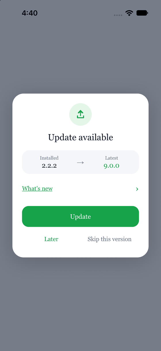
Look at what changed: the button colour, the corner radius and the font.
Colours and sizes
Every token is optional.
| Token | What it changes |
|---|---|
mode | "auto" follows the phone, "light" or "dark" pins it. Default "auto" |
backdrop, card | The dimmed screen behind, and the card |
surface, border | The version row, and the box around release notes |
title, text, muted | Headings, body text, and quiet text such as Skip this version |
primary, primaryText, primarySoft | The Update button and Later, the text on the button, and the icon badge |
danger, dangerSoft | The same, for a forced update |
radius, maxWidth | The card's corner size (buttons scale from it), and its width. 20 and 340 |
fonts | Font names for regular, medium and bold |
Light and dark
mode: 'auto' follows the phone. The two default palettes are exported as LIGHT_THEME and
DARK_THEME, so you can read their values or start from one.
import { resolveTheme } from '@axonpack/in-app-updates';

const theme = resolveTheme({ primary: '#22c55e' }, 'dark'); // the dark palette with your green
Fonts
Give each weight the name of a font you have loaded in your app. A weight you leave out uses the system font. When you give a font, the package does not also set a font weight, because most fonts come as one file per weight.
Text
Every string can change, for translation or for tone. Anything you leave out keeps its default.
| Label | Default |
|---|---|
title | Update available |
forcedTitle | Update required |
message | Empty. Set it to add a line under the title |
forcedMessage | This version is no longer supported. Update to 5.0.0 or newer. |
installed | Installed |
latest | Latest |
releaseNotes | What's new |
update | Update |
later | Later |
skip | Skip this version |
message and forcedMessage are functions, so they can use the versions:
<UpdatePrompt
  labels={{ message: (latest, current) => `Version ${latest} is out. You have ${current}.` }}
/>
The icon
icon replaces what is inside the round badge. It takes any element:
import { UpdatePrompt } from '@axonpack/in-app-updates';
import { Image } from 'react-native';

<UpdatePrompt icon={<Image source={require('./rocket.png')} style={{ width: 28, height: 28 }} />} />;
Next: Your own modal