

Your own modal
Draw the update prompt yourself and keep all the checking and skipping.
Use this page when the default prompt does not fit your design. You write only the look. The package still does the checking, the foreground refresh, the skip memory and the force rules.
Pass your own component as component. The package calls it with everything it needs.
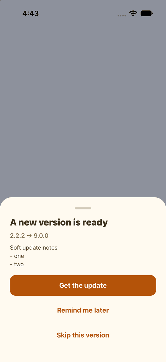
A bottom sheet drawn with plain React Native components.
A complete example
Save it as AppUpdateModal.tsx. It uses only React Native.
import { Modal, Pressable, Text, View } from 'react-native';
import type { UpdateModalProps } from '@axonpack/in-app-updates';

export function AppUpdateModal({
  visible,
  isForced,
  canSkip,
  currentVersion,
  latestVersion,
  releaseNotes,
  onUpdate,
  onDismiss,
  onSkip,
}: UpdateModalProps) {
  return (
    <Modal visible={visible} transparent animationType="slide" onRequestClose={isForced ? undefined : onDismiss}>
      <View style={{ flex: 1, justifyContent: 'flex-end', backgroundColor: 'rgba(0,0,0,0.4)' }}>
        <View style={{ padding: 24, gap: 12, backgroundColor: 'white', borderTopLeftRadius: 24, borderTopRightRadius: 24 }}>
          <Text style={{ fontSize: 20, fontWeight: '700' }}>
            {isForced ? 'Please update to continue' : 'A new version is ready'}
          </Text>
          <Text>
            {currentVersion} to {latestVersion}
          </Text>
          {releaseNotes ? <Text>{releaseNotes}</Text> : null}
          <Pressable onPress={onUpdate}>
            <Text style={{ fontSize: 16, fontWeight: '700' }}>Get the update</Text>
          </Pressable>
          {!isForced && (
            <Pressable onPress={onDismiss}>
              <Text>Remind me later</Text>
            </Pressable>
          )}
          {canSkip && (
            <Pressable onPress={onSkip}>
              <Text>Skip this version</Text>
            </Pressable>
          )}
        </View>
      </View>
    </Modal>
  );
}
Then use it in your root component:
import { UpdatePrompt } from '@axonpack/in-app-updates';
import { Text, View } from 'react-native';

import { AppUpdateModal } from './AppUpdateModal';

export default function App() {
  return (
    <View style={{ flex: 1 }}>
      <Text>My app</Text>
      <UpdatePrompt component={AppUpdateModal} />
    </View>
  );
}
What your component receives
| Prop | Meaning |
|---|---|
visible | Show the modal |
isForced | The update is mandatory. Hide Later and Skip, and ignore the back button |
canSkip | Show Skip. False for a forced update, or when you set canSkip: false |
isUpdating | True from the Update press until the store has opened. Use it for a spinner |
currentVersion, latestVersion | The versions |
minimumVersion | Your minimum version, if one applies |
updateType | major, minor, patch, prerelease or build |
releaseNotes | Text from the store, when it has any |
storeUrl | The store link |
onUpdate | Call it from your Update button. It opens the store |
onDismiss | Call it from Later. It does nothing when the update is forced |
onSkip | Call it from Skip. It does nothing when the update is forced |
theme, labels, icon, notesExpanded | What you passed to <UpdatePrompt />, if you want to use them |
Using your app's own buttons
Swap the pieces for your own components. The three imports below are examples. Replace them with yours:
import { Modal, View } from 'react-native';
import type { UpdateModalProps } from '@axonpack/in-app-updates';

import { Button } from '@/components/button';
import { Text } from '@/components/text';
import { useTheme } from '@/theme';

export function AppUpdateModal({ visible, isForced, isUpdating, canSkip, latestVersion, onUpdate, onDismiss, onSkip }: UpdateModalProps) {
  const { colors } = useTheme();
  return (
    <Modal visible={visible} transparent animationType="fade" onRequestClose={isForced ? undefined : onDismiss}>
      <View style={{ flex: 1, justifyContent: 'center', padding: 24, backgroundColor: 'rgba(0,0,0,0.5)' }}>
        <View style={{ padding: 24, borderRadius: 20, backgroundColor: colors.card }}>
          <Text variant="heading">Version {latestVersion} is out</Text>
          <Button fullWidth isLoading={isUpdating} onPress={onUpdate}>Update</Button>
          {!isForced && <Button variant="ghost" onPress={onDismiss}>Later</Button>}
          {canSkip && <Button variant="ghost" onPress={onSkip}>Skip this version</Button>}
        </View>
      </View>
    </Modal>
  );
}
To do something other than open the store when the user taps Update, give <UpdatePrompt /> an
onUpdate. For example, show your own message when there is no store link.
Next: Force and skip