

The update modal
What the default prompt looks like in every state, and what each part does.
This page shows the prompt in each state, so you know what your users will see. You need it when you want to check that the default prompt is good enough before you change anything.
<UpdatePrompt /> renders nothing while the app is up to date. When an update is due, it opens over
the current screen.
A soft update
A soft update is one people can postpone.
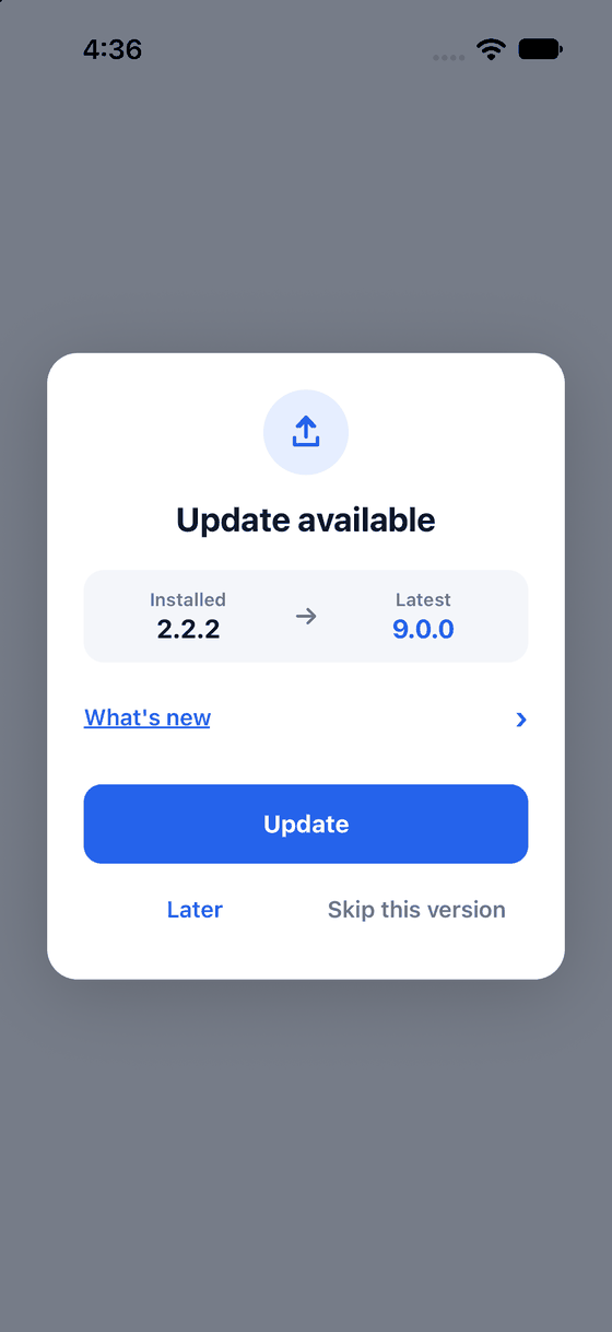
Look at the three actions: Update (the big button), Later and Skip this version.
| Part | What it does |
|---|---|
| Update | Opens the store. A spinner shows until the store has opened |
| Later | Hides the prompt until the app next starts |
| Skip this version | Hides it until a newer version comes out. See Force and skip |
Release notes
When the store gives release notes, a What's new row appears. It is underlined and starts closed.
Tap it to open the notes, and tap again to close them. Set notesExpanded on <UpdatePrompt /> to
start it open.
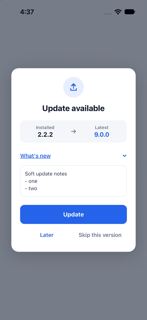
Look at the chevron and the notes box under What's new.
The App Store gives notes. Google Play does not, so on Android the row is missing.
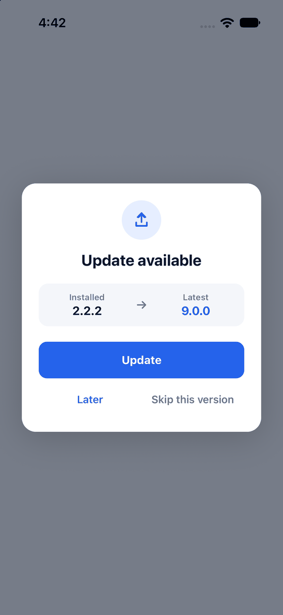
With no notes, the row is not shown at all.
A forced update
A forced update is one people cannot postpone.
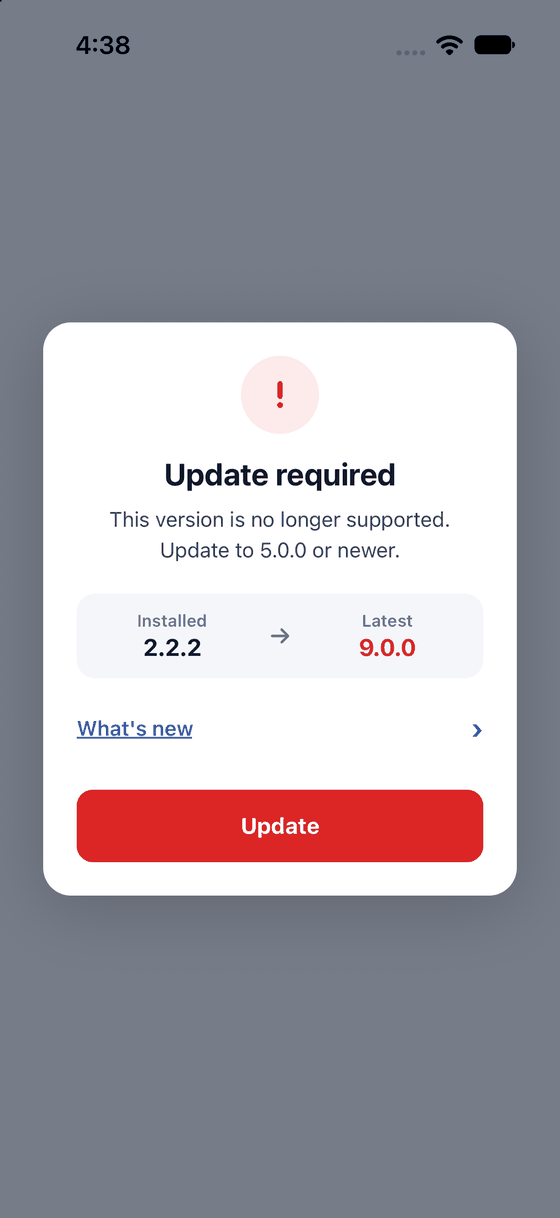
Look at the red badge and the single Update button. Later and Skip are gone.
On Android the back button does nothing. An update is forced when the installed version is below the
minimumVersion, or when your required rule says so. See
Force and skip.
Dark mode
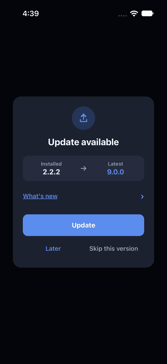
Look at the dark card. The same prompt, with the dark colours.
The prompt follows the phone's light or dark setting. To pin it, use theme={{ mode: 'dark' }} or
'light'. If your app sets userInterfaceStyle to "light" in app.json, the phone always reports
light to your app, so the prompt stays light.
Your colours and fonts
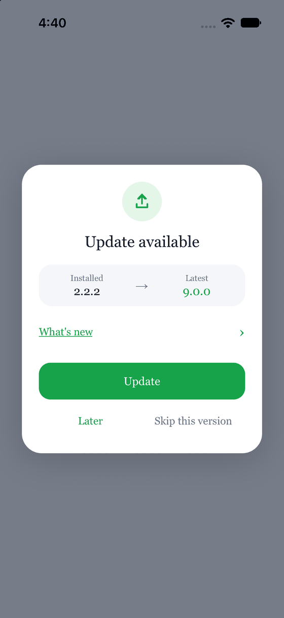
Look at the green button, the larger corners and the serif font.
See Theming.
Your own design
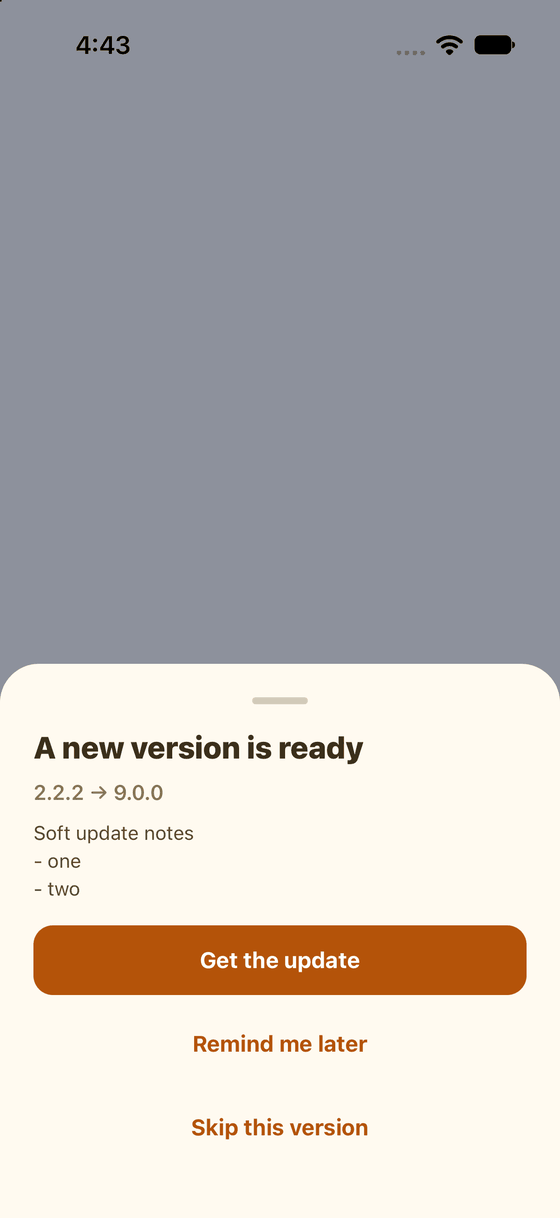
A bottom sheet the app drew itself. The library only supplied the data and the buttons' actions.
See Your own modal.
Next: Theming