

Themes
Seven built-in palettes, and your own as a patch over any of them.
The panel ships seven themes and takes your own. The header is one row: the tabs, the palette button, then close. The palette button lists every theme and switches the panel immediately.
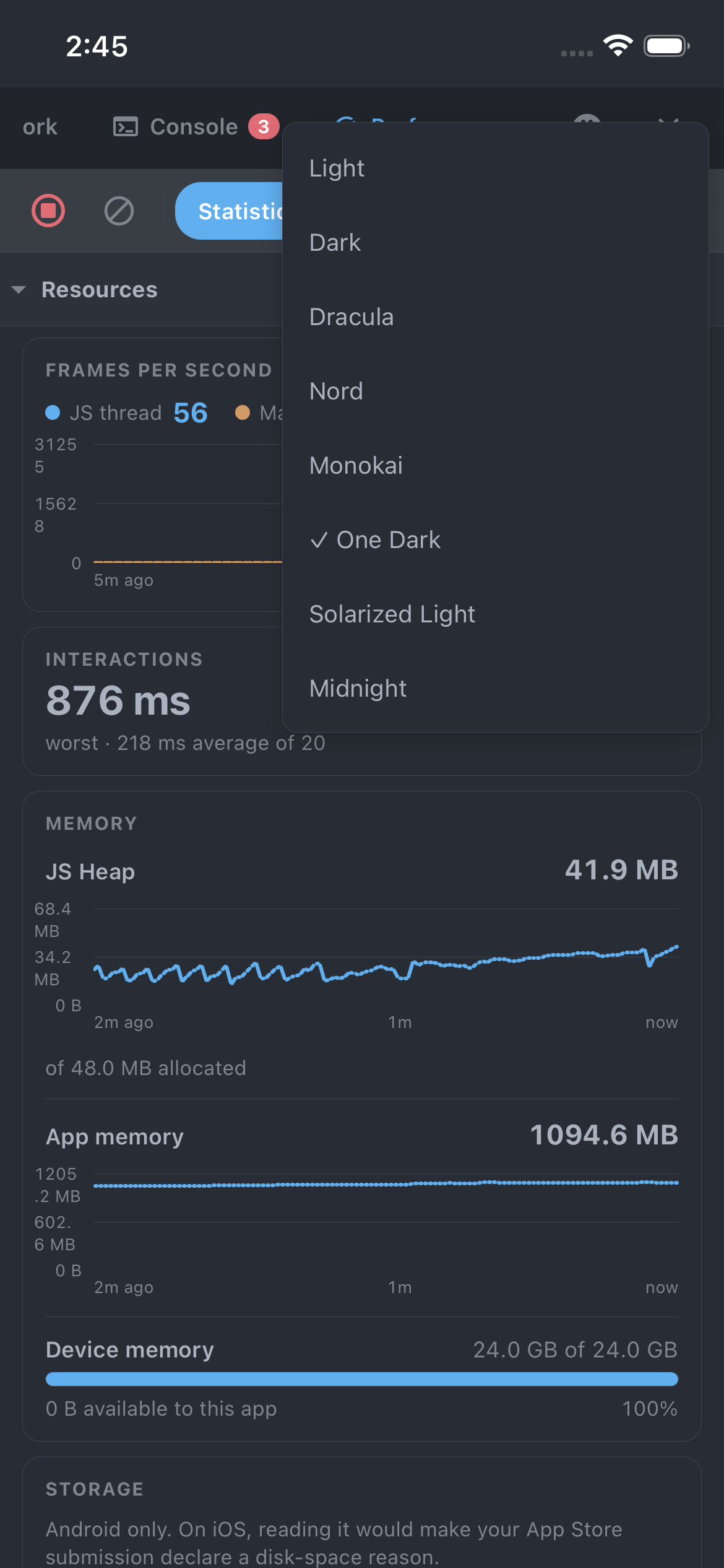
The seven built-ins
| Id | Where it comes from |
|---|---|
light | Chrome DevTools' light Network tab, the default |
dark | Chrome DevTools' own dark theme |
dracula | Dracula |
nord | Nord |
monokai | Monokai, as in TextMate and Sublime |
one-dark | One Dark, from Atom |
solarized-light | Solarized Light, the second of the two light options |
Each is the project's published colours mapped onto this panel's tokens, not an approximation.
Your own
Pick which one the panel opens with, and add your own:
<DevtoolsProvider
  config={{
    defaultTheme: 'midnight',
    themes: { midnight: { base: 'dark', colors: { accent: '#a78bfa' } } },
  }}>
A theme names a base to inherit from (any of the seven) and overrides only the tokens it cares about,
so a one-colour change is a one-line entry rather than a copy of all of them that rots whenever a token
is added.
- Reuse a built-in's id as your own name and you replace it.
- A
defaultThemenaming something that was never registered is ignored, rather than leaving the panel unstyled. - A theme can also carry a
statusBarStyle, which decides the colour of the clock and icons while the panel is open. Leave it out and it is read off the theme's own colours.
The full token list is the Palette type, exported from the package root and documented in
Themes reference.
The choice lives in memory for the session, like the tab you last had open. Persisting it would mean taking a storage dependency for a devtools colour scheme.